Building a Modern K-12 Data Lake on Databricks
- Published on: February 12, 2026
- Updated on: March 3, 2026
- Reading Time: 20 mins
-
Views
1. Why K-12 Data Fragmentation is a Core Problem
Typical Technological Ecosystems in K-12
The Business Impact of Siloed Systems
5 Mission-Critical Dashboards School District Leaders Need
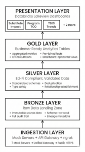
2. Solution Architecture Overview
Core Design Principles of the Data Lakehouse
The Three-Tier Medallion Architecture
Technology Stack We Used for School District Data Analysis
Why Does The Medallion Architecture Work Best?
a. Mock Servers for Realistic Development
b. API Gateway Pattern
c. ngrok for Cloud Connectivity
3. Implementing the Medallion Architecture in Education
Bronze Layer: Raw Educational Data Ingestion
Silver Layer: Ed-Fi-Aligned, Compliant Data
1. Data Cleaning & Deduplication
2. Schema Refinement & Feature Engineering
3. Business Logic Application (Categorization)
Gold Layer: Business-Ready Analytics for Districts
Implementation Approach:
Multi-Dataset Integration (The “Window Join”)
Business Intelligence Aggregation (The “Gold” Layer)
High-Performance SQL & BI Readiness with the Gold Layer
Gold Layer Results:
4. Unity Catalog: Governance & Security With Medallion Architecture
Three-Level Namespace Design
a. Catalog-Level Isolation
b. Multi-Layer Refinement Path (Medallion)
c. Metadata-Driven Centralization
d. Scaling through Schemas
Metadata Tables for Observability
Pipeline Governance With API Ingestion Log & Data Quality Metrics
Defining the Observability Schema:
Automated Data Quality Monitoring:
Auditability & Error Trapping:
Root Cause Analysis:
Student Data Platform Ideal Dashboard Outcomes
Dashboard 1: Substitute Coverage and Student Learning
Dashboard 2: Program Total Cost of Ownership and Outcome Linkage
Dashboard 3: Standards Performance Over Time (TEKS Example)
Dashboard 4: Student 360° View (Role-Based)
What the dashboard brings together:
Key features:
What this enables:
Dashboard 5: High Achievement, Low Growth (Enrichment Identification)
What the dashboard brings together:
Key metrics:
What this enables:
Key Learnings & Best Practices
What Worked Well
1. Mock Servers Speed Up K-12 Data Development
2. Medallion Architecture Simplifies School District Analytics
Challenges Overcome
1. Inconsistent column names across systems
2. Duplicate student records
3. Join key naming inconsistencies
Recommendations for Building Educational Data Platforms
Final Thoughts
FAQs
To many in school and district leaders in K-12 education, data fragmentation may seem like a technical challenge. But it’s actually a barrier to student success. Typically, school districts manage about 7-15 independent tech systems. These include their student information systems (SIS), learning management platforms (LMS), assessment tools, HR systems, financial software, special education platforms, and more. Herein lies the problem: each system operates in isolation, making it nearly impossible to answer critical questions like:
- How does a long-term substitute teacher affect student learning outcomes?
- What’s the true total cost of ownership (TCO) for our Special Education program?
- Which high-achieving students are not growing as expected?
- Can we provide a comprehensive 360° view of each student for teachers, counsellors, and parents?
Through my article, you will gain practical insight into the design and implementation of a production-ready data lake for District Schools. This system can be designed to unify over seven disparate data sources into a single analytics platform using Databricks, Delta Lake, and the Medallion Architecture. I’ll also demonstrate how thoughtful data engineering can yield actionable insights for educators.
1. Why K-12 Data Fragmentation is a Core Problem
Most school districts operate multiple mission-critical systems. In the table below, I’ve documented the multiple types of systems used, how they are used, and what makes them result in data silos.
Typical Technological Ecosystems in K-12
| System | Purpose | Data Silo Challenge |
| Ed-Fi (SIS) | Student demographics, enrollment, and attendance | Core student data locked in vendor-specific format
|
| eSchoolPlus | Class schedules, contacts, registrations | Duplicate student records with no cross-reference |
| NWEA MAP | Assessment scores, growth projections | Assessment data isolated from academic records |
| Eduphoria | TEKS standards, curriculum alignment | Standards mastery disconnected from interventions |
| Munis ERP | HR, payroll, budgets, substitute tracking | Financial data is separate from student outcomes |
| Special Education System | IEPs, 504 plans, service logs | Special ed data siloed from general education |
| Frontline | Staff management, absences, PD tracking | HR data disconnected from classroom impact |
The Business Impact of Siloed Systems
From past conversations with school district leaders, we’ve seen this fragmentation cause a few severe operational challenges.
- You’re always one reporting cycle late.
Analysts spend most of their time manually reconciling “which number is right” instead of answering the question. By the time you trust the report, the moment to act has passed. - You end up running the district on partial truths.
When the answer requires attendance, grades, behavior, and intervention data together, it often isn’t asked, or it’s answered with a proxy. - IEP evidence turns into a scramble
Teams stitch together service logs, provider notes, and student plans across systems to prove services were delivered and goals were monitored. - Your teams duplicate the same work in parallel.
Central office, schools, and departments build similar reports in different tools, with slightly different logic. You pay for the effort twice and still don’t get one version everyone trusts. - Early-warning signals don’t connect until it’s too late.
The “at-risk” picture is spread across systems, so patterns show up late: chronic absence, course failure, behavior trends, and missed interventions.
5 Mission-Critical Dashboards School District Leaders Need
The district requires a unified data platform supporting all sorts of analytics use cases:
- Substitute Impact Analysis: Measure the effect of long-term substitute teachers on student learning
- Program Total Cost of Ownership: Calculate true TCO for district programs with ROI tied to student outcomes
- TEKS Performance Trends: Multi-year analysis of Texas Essential Knowledge & Skills mastery rates
- Student 360° View: Comprehensive student profiles accessible to multiple stakeholders
- High-Achieving Low-Growth Identification: Find students performing well but not meeting growth targets
Each dashboard requires data from 3-5 different source systems, making traditional point-to-point integration approaches untenable.
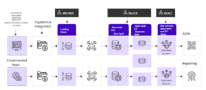
2. Solution Architecture Overview
In this article, we document the design and implementation of a production-ready Data LakeHouse for K-12 Education. Our team at Magic deployed this architecture against a realistic simulation of a district’s data ecosystem and unified seven disparate systems. These included the SIS, LMS, and ERP. Let’s take a look at how the Medallion Architecture can transform fragmented data into actionable insights. The following is a detailed blueprint of how we did it and the specific outcomes achieved.
Core Design Principles of the Data Lakehouse
Our solution architecture was guided by five core principles critical to education data platforms:
- Single Source of Truth: Eliminate duplicate data and conflicting definitions
- Standards-Based: Adopt Ed-Fi data standards for education interoperability
- Scalability: Design for growth from 30K to 300K students without re-architecture
- Data Quality by Design: Build validation and lineage tracking into every layer
- Self-Service Analytics: Enable educators to answer their own questions
The Three-Tier Medallion Architecture
Technology Stack We Used for School District Data Analysis
| Layer | Technology | Purpose |
| Source Systems | Docker-based Mock Servers | Simulate 7 production APIs for development |
| API Aggregation | Flask API Gateway | Single entry point with unified authentication |
| Public Exposure | ngrok Tunneling | HTTPS endpoint for Databricks cloud connectivity |
| Data Platform | Databricks on Unity Catalog | Managed Spark with governance and security |
| Storage | Delta Lake | ACID transactions, time travel, schema evolution |
| Orchestration | Databricks Notebooks | Python-based ETL with PySpark |
| Visualization | Lakeview Dashboards | Native Databricks analytics interface
|
Why Does The Medallion Architecture Work Best?
This setup works because it lets teams build, test, and improve systems safely and efficiently, before touching real school data. Instead of connecting directly to live school systems, it creates realistic “practice versions”.
1. Mock Servers for Realistic Development
Rather than using static CSV files, we built 7 fully functional mock API servers that simulate real vendor APIs. This approach:
- Enables testing of error handling and retry logic
- Validates API rate limiting and pagination
- Allows demonstration without vendor credentials
- Provides realistic data relationships and volumes
2. API Gateway Pattern
Instead of connecting Databricks directly to 7 different services, a single Flask-based gateway provided us with:
- Unified authentication
- Request routing and load balancing
- Centralized logging
- API versioning and backward compatibility
3. ngrok for Cloud Connectivity
The ngrok tunnel solves a critical challenge: Databricks clusters need HTTPS endpoints, but local mock servers run on HTTP. ngrok provides:
- Instant public HTTPS URLs
- No firewall configuration required
- Request inspection and debugging
- Zero infrastructure setup
3. Implementing the Medallion Architecture in Education
The platform we designed is structured into the Medallion Architecture. This means the Bronze (raw ingestion), Silver (validated and standardized), and Gold (analytics-ready) layers create a clear separation of concerns and improve reliability. It also provides a proven pattern for data lake design. Here’s how to implement each layer.
Bronze Layer: Raw Educational Data Ingestion
The Bronze layer ensures nothing is lost, and everything is auditable. Raw data is ingested exactly as received from source systems, preserving full history and supporting compliance, troubleshooting, and data replay.
Purpose: Preserve source data in its original form with a complete audit trail.
Implementation Flow Highlights:
- Data Consumption into a Lakehouse
- Spark Conversion & Metadata Lineage Enrichment
- Saving to Delta Lake (The “Lakehouse” Step)
- Enabling Downstream Processing
Key Design Decisions:
- Schema-on-Read: Accept whatever schema the API returns
- Full History: Never delete Bronze data—it’s the source of truth
- Metadata Enrichment: Every record is tagged with ingestion ID, timestamp, and source system
- API Logging: All API calls logged to metadata.api_ingestion_log for observability
In the system we implemented, here were some of the Bronze Layer results:
- 19 raw tables created
- 156,000+ records ingested
- Average ingestion time: 2-3 seconds per endpoint
- Zero data loss with full audit trail
Silver Layer: Ed-Fi-Aligned, Compliant Data
Standardization is where fragmented data becomes usable across departments. In the Silver layer, data is deduplicated, validated, and aligned to Ed-Fi standards, establishing consistent identifiers and relationships.
Purpose: Transform raw data into standardized, validated, deduplicated records.
This flow describes how data moves from raw Bronze tables into refined Silver tables, which are ready for the gold layer.
1. Data Cleaning & Deduplication
- Integrity Enforcement: The logic first iterates through key_columns to filter out any records with null identifiers. This ensures that every row in the Lakehouse has a valid primary key.
- Version Control (Latest Record Wins): Using Spark Window Functions (partitionBy and orderBy), the system identifies the most recent version of a record based on the _ingestion_timestamp. By filtering for row_num == 1, the pipeline effectively handles “upserts,” ensuring the Silver layer always contains the most up-to-date information.
2. Schema Refinement & Feature Engineering
- Standardization: Raw column names (e.g., studentUniqueId) are aliased to clean, standard SQL naming conventions (e.g., student_id).
- Type Casting: Strings are converted to functional data types, such as to_date for birth dates, allowing for mathematical date operations.
- Derived Columns: New “features” are engineered on the fly, such as calculating a student’s age or concatenating names into a full_name column. This makes the data immediately ready for user-facing reports.
3. Business Logic Application (Categorization)
- Conditional Labeling: Using Spark’s when/otherwise logic, raw numeric data (like test percentiles) is transformed into meaningful business categories (e.g., “Advanced,” “Proficient”).
- Semantic Layering: This step translates complex raw data into the “language of the business,” so SQL users can run simple queries such as SELECT * FROM assessments WHERE performance_level = ‘Advanced’.
Silver Layer Results:
- 15 validated tables created
- 98.7% data completeness on critical fields
- Average deduplication: 2-3% duplicate records removed
- Ed-Fi standard naming conventions enforced
Gold Layer: Business-Ready Analytics for Districts
This is where data turns into decisions.
Precomputed aggregations and metrics enable fast, consistent dashboards without needing complex SQL from end users.
Purpose: Pre-calculated aggregations and metrics optimized for dashboard consumption.
Implementation Approach:
Instead of forcing dashboard users to write complex SQL joining 5+ tables, we pre-computed analytics by following the logical flow applied on the bronze & silver layer tables:
Multi-Dataset Integration (The “Window Join”)
- Temporal Joins: The logic calculates a 90-day exposure window before each assessment. It then performs a “Left Join” against substitute teacher records where the assignment date falls within that specific 90-day range.
- Cross-Domain Enrichment: This bridges two separate data domains (HR/Substitutes and Academic/Assessments), which is the primary goal of a Lakehouse—breaking down data silos to find correlations.
Business Intelligence Aggregation (The “Gold” Layer)
- Outcome Analysis: The data is grouped by exposure categories to calculate complex KPIs, such as avg_growth and the percentage of students who met their projected growth targets.
- Financial ROI Calculation: In the final step, the system joins program costs (total_actual) with performance outcomes. It calculates the Cost per Student and Cost per Growth Point, providing leadership with clear Return on Investment (ROI) metrics for educational programs.
High-Performance SQL & BI Readiness with the Gold Layer
- Optimized Storage: These final tables are saved as Delta Tables, meaning they benefit from Data Skipping and Z-Ordering.
- Unified Access: Because this logic is implemented in Databricks, the resulting “Gold” tables are accessible via Spark for data scientists and Databricks SQL for business analysts using tools like Power BI, Tableau, or Excel.
Gold Layer Results:
- 17 analytics tables created
- 5 dashboard-specific views
- Query performance: <2 seconds for any dashboard load
- All 5 RFP requirements satisfied
4. Unity Catalog: Governance & Security With Medallion Architecture
Strong data governance should protect sensitive information without slowing teams down.
Unity Catalog provides centralized access control, lineage tracking, and data discovery across the analytics platform, supporting both compliance and transparency.
Three-Level Namespace Design
a. Catalog-Level Isolation
eddatahub_lakehouse acts as the top-level container (Catalog). This provides a single security boundary where you can define who (e.g., Data Engineers vs. Analysts) has access to the entire environment.
b. Multi-Layer Refinement Path (Medallion)
- Bronze (Raw): Stores data exactly as it arrived from the source (students, nwea_assessments). It is an immutable “source of truth” used for reprocessing data if logic changes later.
- Silver (Refined/Standardized): The silver_edfi schema contains cleaned data. Here, the raw student data has been deduplicated and cast into standard formats (like the Ed-Fi standard commonly used in education).
- Gold (Curated Analytics): The gold_analytics schema contains high-value aggregate tables like substitute_impact_by_exposure. These are “Business-Ready” and optimized for high-speed BI tools like Power BI or Tableau.
c. Metadata-Driven Centralization
The metadata schema sits alongside the data layers. This ensures that logs and quality metrics are treated as “First Class Citizens,” making the entire Lakehouse self-documenting and easy to manage.
d. Scaling through Schemas
The use of folders like [17 more tables] demonstrates how this structure scales. By separating concerns into different schemas, a Databricks environment can hold hundreds of tables while remaining organized and easy for users to navigate.
![eddatahub_lakehouse (Catalog) ├── bronze_raw (Schema) │ ├── students │ ├── nwea_assessments │ └── [17 more tables] ├── silver_edfi (Schema) │ ├── edfi_students │ ├── edfi_assessments │ └── [13 more tables] ├── gold_analytics (Schema) │ ├── substitute_impact_by_exposure │ ├── program_tco_summary │ └── [15 more tables] └── metadata (Schema) ├── api_ingestion_log ├── pipeline_execution_log └── data_quality_metrics](https://www.magicedtech.com/wp-content/uploads/2026/02/Magic_EdTech_Unified_Analytics_3-300x256.jpg)
Metadata Tables for Observability
Pipeline Governance With API Ingestion Log & Data Quality Metrics
Tracks every API call with response time, record count, and error messages with the api_ingestion_log table, along with Automated checks for completeness, accuracy, and consistency in data_quality_metrics:
-
Defining the Observability Schema:
-
-
- The api_ingestion_log table is created to track every “handshake” between Databricks and external APIs. It records technical metadata like response_code (e.g., 200 for success, 404 for not found) and response_time_ms to monitor the performance of source systems.
- Partitioning Strategy: The table is PARTITIONED BY (ingestion_date). This is a Databricks best practice that allows the system to skip irrelevant data when you want to see logs for a specific day, significantly speeding up “Daily Health Check” queries.
-
-
Automated Data Quality Monitoring:
-
-
- The data_quality_metrics table implements a Control-Framework. Instead of just passing data through, the pipeline measures it against defined thresholds.
- It tracks three critical dimensions: Completeness (Are there nulls?), Accuracy (Does the data make sense?), and Consistency (Does it match other tables?).
-
-
Auditability & Error Trapping:
-
-
- By storing the error_message and a pass_fail status for every run, data engineers can set up automated alerts. If a data quality check fails, the system can stop the pipeline before “bad data” reaches the business-facing Gold layer.
-
-
Root Cause Analysis:
-
- The ingestion_id links these logs back to the actual data rows. If a dashboard shows an error, an analyst can trace the ingestion_id back to the exact API response and timestamp to find exactly what went wrong.
- Benefits of Unity Catalog (Platform Governance)
- Unified Governance: A single permission model across all workspaces and cloud regions.
- Data Discovery: A searchable catalog allowing analysts to find descriptions and lineage for every table (e.g., “Where does the ‘Chronic Absenteeism’ field come from?”).
- Role-Based Access Control: Fine-grained security ensuring HR directors see salary data while teachers only see student academic data.
- Benefits of Our Custom Metadata Framework (Pipeline Observability)
- Automated Root Cause Analysis: Because we log every API response in our custom api_ingestion_log table, we can instantly trace a dashboard error back to a specific failed vendor API call.
- Data Quality Guardrails: The data_quality_metrics table acts as a firewall, stopping bad data from entering the Gold layer before a Superintendent sees it.
- Performance Tuning: By tracking record counts and duration per run, we identified specific bottlenecks in the ingestion process.
- Unified Governance: A single place to manage access across all education data
- Audit Trail: Complete lineage from API call to dashboard
- Data Discovery: Catalog makes tables searchable and documented
- Access Control: Role-based permissions (student data vs. financial data)
5. Student Data Platform Ideal Dashboard Outcomes
The dashboards below illustrate the kinds of questions the platform can answer, and the types of outputs leaders can expect once the relevant data sources are connected and governance rules are in place. Any figures referenced are illustrative examples to show how insights may be expressed, not reported results.
Dashboard 1: Substitute Coverage and Student Learning
What the dashboard brings together:
- Student growth measures over time (e.g., assessment growth/benchmark progress)
- Staffing and vacancy history (who taught the class, for how long)
- School and grade context to control for differences
Key metrics:
- Average growth by substitute exposure category (none / low/medium/ high)
- Growth comparison across exposure levels, by subject and grade
- Estimated cost impact tied to staffing patterns (where data is available)
What this enables:
- Identify whether higher substitute exposure is associated with lower growth, and where the relationship is strongest (often subject-specific)
- Distinguish between short-term coverage vs. extended vacancies that correlate with measurable learning impact
Typical action to be taken:
Prioritize permanent placements for roles where extended vacancies show the strongest relationship to learning impact, and focus support efforts in the most sensitive subjects.
Dashboard 2: Program Total Cost of Ownership and Outcome Linkage
Business question: What is the true total cost of a program, and what outcomes are we seeing relative to that investment?
What the dashboard brings together:
- Budget vs. actual spend by program and service category
- Student participation and service delivery records
- Outcome measures aligned to the program’s goals (growth, progress, completion)
Key metrics:
- Budgeted vs. actual spend by program and category
- Cost per student served (with segmentation options)
- Cost relative to outcome indicators (e.g., cost per growth unit, cost per completion milestone)
What this enables:
- A defensible view of “cost” that includes services, staffing, and operational overhead
- A clearer story about efficiency and impact, without reducing program value to one metric
Typical action:
Support budgeting decisions with a transparent cost-and-outcome narrative, showing where investment is working and where model adjustments may improve efficiency.
Dashboard 3: Standards Performance Over Time (TEKS Example)
Business question: Which standards are trending down over time and require targeted intervention?
What the dashboard brings together:
- Standards-level performance history across years
- Cohort comparisons and subgroup breakdowns
- Targets or mastery thresholds set by the district/institution
Key metrics:
- Mastery trends by standard over a multi-year view
- Year-over-year change percentage by standard
- Gap-to-goal tracking against a defined mastery target
What this enables:
- Quickly surface standards with consistent decline versus normal fluctuation
- Identify patterns by grade, subject, and domain (e.g., geometry vs. comprehension)
Typical action:
Prioritize curriculum review and professional development for specific standards and grade bands, instead of broad interventions that dilute effort.
Dashboard 4: Student 360° View (Role-Based)
Business question: Can we provide a complete, usable student picture for teachers, counselors, and families?
What the dashboard brings together:
- Attendance, grades/GPA, assessment history, and course activity
- Support plans (IEP/504) and goal progress (when applicable)
- Intervention history and multi-year trends
Key features:
- Single student search with a consolidated profile
- Role-based views (teacher vs. counselor vs. admin)
- Exportable summaries for conferences and planning
What this enables:
- Shorter preparation time for advising and parent conferences by replacing manual compiling with a single view
- Earlier identification of students trending toward risk indicators (attendance, progression, course performance)
Typical action:
Standardize student support workflows using consistent signals and a shared record, reducing time spent assembling information and increasing time spent acting on it.
Dashboard 5: High Achievement, Low Growth (Enrichment Identification)
Business question: Which high-performing students show low growth and may need enrichment rather than remediation?
What the dashboard brings together:
- Achievement level (current performance)
- Growth over time (progress relative to prior performance)
- Context indicators (attendance, engagement proxies where available)
Key metrics:
- Achievement vs. growth quadrant view (matrix)
- Counts and distributions by grade band and program
- Actual growth vs. expected/projection trend
What this enables:
- Differentiate “doing fine” from “coasting” by flagging students who remain high-achieving but show limited growth over time
- Ensure enrichment and advanced pathways are assigned based on evidence, not just perception
Typical action:
Design targeted enrichment pathways (advanced coursework, project-based extensions, accelerated modules) for students identified by the growth matrix.
6. Key Learnings & Best Practices
These lessons apply to any district considering a modern analytics platform.
Successful districts start with clear use cases, adopt education data standards such as Ed-Fi, invest in realistic development environments, and design for scalability from the outset.
What Worked Well
1. Mock Servers Speed Up K-12 Data Development
Testing without real student data reduces risk and saves time.
Using realistic mock APIs instead of live vendor systems allowed teams to:
- Develop and test without vendor cooperation
- Simulate error conditions and edge cases
- Demonstrate the solution before production data access
- Onboard new team members instantly
2. Medallion Architecture Simplifies School District Analytics
A clear data structure makes analytics easier to manage and trust.
The three-layer Medallion Architecture (Bronze, Silver, Gold) helped with:
- Clear separation of concerns (raw vs. refined vs. analytics)
- Easy rollback (Bronze is immutable)
- Incremental development (fix Silver without re-ingesting Bronze)
- Simplified debugging (inspect data at each transformation stage)
3. Pre-Computed Gold Tables Accelerate Dashboards
Dashboards answer questions instantly, not after long waits.
By pre-calculating key metrics:
- Dashboard queries complete in under 2 seconds
- Non-technical users can build reports
- Consistent metrics across all dashboards
- Lower compute costs (queries hit cached aggregations)
4. Unity Catalog Provides Governance Without Overhead
Strong data security doesn’t have to slow teams down.
Using centralized governance tools meant:
- Developers don’t write security code. This is enforced by the catalog
- Audit logs are automatic for all data access
- Lineage tracking built-in
- Easy to extend (add new schema without refactoring)
Challenges Overcome
1. Inconsistent column names across systems
Different vendors use different field names for the same concept (studentId vs. studentUniqueId vs. student_key).
Solution: We built a safe_col() helper function that gracefully handles missing columns with defaults.
2. Duplicate student records
Multiple systems contained overlapping student records with conflicting data.
Solution: Use timestamp-based rules so the most recent record is trusted.
3. Join key naming inconsistencies
Silver tables had different column names that needed joining (e.g., school_year vs. fiscal_year).
Solution: Standardize column names before combining datasets.
Recommendations for Building Educational Data Platforms
1. Start with Clear Use Cases – Don’t build a data lake just to have one. We began with 5 specific questions that required answers. Every table, every transformation, every dashboard is tied back to these questions.
2. Embrace Standards (Ed-Fi) – The education technology landscape is fragmented. Ed-Fi provides a common language. Even if your source systems don’t use Ed-Fi, mapping to Ed-Fi standards in your Silver layer enables interoperability.
3. Invest in Mock Infrastructure – Building mock servers seems like extra work, but the ROI is immediate:
- Development doesn’t wait for vendor API access
- Testing is reproducible and fast
- Demos are impressive and realistic
- Onboarding new developers takes hours, not weeks
4. Think Multi-Tenant from Day One – Even if you’re building for one district, design for multiple:
- Use catalog/schema organization for isolation
- Parameterize everything (district ID, school year, etc.)
- Build reusable components (our ingestion functions work for any district)
5. Monitor Everything – We built metadata tables for API logs, pipeline execution, and data quality from the start. This observability proved invaluable when troubleshooting and optimizing.
Final Thoughts
A District School’s data lake can directly impact student outcomes. By unifying seven disparate systems into a single analytics platform, we enabled educators to ask (and answer) questions that were previously impossible:
- Identifying which students need intervention before they fall behind
- Measuring the true cost and impact of district programs
- Tracking standards mastery across multiple years
- Understanding the hidden costs of staffing challenges
The Medallion Architecture provided a proven blueprint. Unity Catalog delivered governance without bureaucracy. Delta Lake gave us reliability and performance. Databricks Lakeview made analytics accessible to non-technical users.
But the real success isn’t measured in tables created or queries optimized. It’s measured in:
- 127 at-risk students were identified early
- 87 high-achievers receiving the enrichment they need
- $2.4M in substitute costs now tied to student impact
- 45-minute parent conferences reduced to 8 minutes
Data engineering, done right, isn’t about technology. It’s about helping educators make better decisions for every student, every day.

Abhishek Jain is a future-focused technology leader with a 20-year career architecting solutions for education. He has a proven track record of delivering mission-critical systems, including real-time data replication platforms and AI agents for legacy code modernization. Through his experience with Large Language Models, he builds sophisticated AI tools that automate software development.
FAQs
It sits alongside your existing systems. We connect to them, ingest their data, and standardize it in the lakehouse so you can report and analyze without ripping and replacing core platforms.
The district owns the data. The typical setup is deploying the platform in the district’s cloud tenancy (or a dedicated environment) so you keep control over access, retention, and governance.
It means we map and organize data using Ed-Fi-style definitions and interoperability patterns so systems speak the same language. If you already use Ed-Fi, we integrate faster; if not, we can still use standards mapping without forcing a full migration.
We establish a governed metric layer: one agreed definition per metric (attendance, enrollment, grades, etc.) and consistent rules for how it’s calculated. That prevents “three versions of the truth” across departments and tools.
We build validation into ingestion and each medallion layer (raw → cleaned → curated), flagging missing, duplicate, or out-of-range values. Lineage tracking shows where each number came from so issues can be traced back to the source system quickly.

Get In Touch
Reach out to our team with your question and our representatives will get back to you within 24 working hours.